I spent a lot of time today looking at the work of Andy Potts. His style is very vibrant and freeflowing with lots of elements blended together or layered over each other which creates so much detail you can spend ages looking at his art. But not too much detail it all seems cluttered, the balance seems just right.
I love how the colours work so well together. If i tried something like this they would just clash and look like a 3 year olds first attempt at finger painting. He obviously has a great understanding of what colours work together and what ones don't.
The picture above shows a slightly different style of his, perhaps some of his earlier work. It still looks amazing and you can tell a lot of thought goes into it all.
Potts has produced work for some big names, including Microsoft, IBM and the BBC. You can see why, his work is so eye catching and creative it is the perfect way to advertise.
I could easily stare at his website for hours going through his work for hours, so i will.
Edit: The blog doesn't seem to like very wide photos so i had to scale them all down
This is my blog for one of my college assignments. I am developing my own version of The Verve's Urban Hymns album cover using a mix of photography and photoshop. Here i will post all my research and progress. Oh and i should have noticed my url says 'anal bum' before finalising it... hindsight for ya
Monday, 6 December 2010
Julian Opie style art
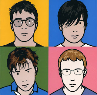
To learn more about album covers and photoshop techniques we were given the task of recreating a photo of ourselves in the style of Julian Opie, the creator of the iconic artwork that appears on Blur's Best Of album cover. This album cover became known as defining the band's image and style from.
Opie's style seems simplistic and is easy to recreate in photoshop, although to get the same quality as his work requires patience and attention to detail. When he creates portraits the hair seems to have the most detail, and the rest of the person is kept very simplistic. He doesn't just create portraits, he recreates a variety of things in his unique style.
An example of a van in Opie's style
To create my own image in this style first i had to get a face on photograph of me, ensuring my mouth was closed as this is a repeating element in Opie's work. After opening the photo in photoshop i created a new layer and began to draw around the shape of my head with the pen tool, making sure my hair was outlined separately. I did this until i had drawn around all the elements that i wanted to include and created a new white layer underneath the pen layer, but above the original photo.
The original image, kept small for your sake
Step 1 complete
I then began to colour the image in using the brush tool on a layer underneath the lines so i didn't have to worry about being very precise. I then added a gradient background to complete the look.
Step 2 complete
Although now complete, i had some extra time and decided to add a little more detail and painting in some shading by using the lasso tool to draw areas i wanted in shadow and then coloured them slightly darker.
The final image plus shading. Not sure which one i prefer but i learnt a lot doing this extra step.
And that's how i made an image of myself in Julian Opie's style. Simples.
Subscribe to:
Comments (Atom)


