These are the lyrics to The Verve's lead song from Urban Hymns; Bittersweet Symphony. These words are my main inspiration for my album cover as they describe many of the themes of modern life; money obsession, desensitisation to sex and violence and how modern life expects so much from us. I feel this would best fit my album cover of the street with the photoshopped road signs.
Cause it's a bitter sweet symphony this life...
Try to make ends meet , you're a slave to the money then you die.
I'll take you down the only road I've ever been down...
You know the one that takes you to the places where all the things meet, yeah.
No change, I can change, I can change, I can change,
but I'm here in my mould , I am here in my mould.
But I'm a million different people from one day to the next...
I can't change my mould , no,no,no,no,no,no,no
Well I've never prayed,
But tonight I'm on my knees, yeah.
I need to hear some sounds that recognise the pain in me, yeah.
I let the melody shine, let it cleanse my mind , I feel free now.
But the airwaves are clean and there's nobody singing to me now.
No change, I can change, I can change, I can change,
but I'm here in my mould , I am here in my mould.
And I'm a million different people from one day to the next
I can't change my mould, no,no,no,no,no,no,no
Have you ever been down?
I can change, I can change...
Cause it's a bittersweet symphony this life.
Trying to make ends meet, try to find somebody then you die.
You know I can change, I can change, I can change,
but I'm here in my mould, I am here in my mould.
And I'm a million different people from one day to the next.
I can't change my mould, no,no,no,no,no,no,no
We've got ya sex and violence melody and silence
(Have you ever been down)
(I'll take you down the only road I've ever been down)
One of the key tracks of the album, i feel this one's lyrics will inspire me the most. It describes modern life and the internal conflicts associated with it. This has led me to develop new ideas for my album cover, backing and insert.
Monday, 29 November 2010
Wednesday, 24 November 2010
capturing screenshots and creating actions in photoshop
To capture the screen shots below i used Command + Shift + 3 to capture the entire screen so i could take many screen shots quickly and easily. After i captured all the stills i wanted i put them into a folder, opened one of them in photoshop and created an action which i could apply to every image to make the cropping quicker. Here is how i done it:
I started by opening the screen grab in photoshop.

I then opened the actions window and created a new action folder and a custom action.
After naming the action i made sure it was recording and then cropped the screen grab to the size i wanted.

To apply the crop effect to all the screen shots i used the Batch tool.

After selecting the input and output paths i began the process which saved me like... 15 minutes of work. Now i know this technique i am sure it will help me with a lot of my photoshop work.

I started by opening the screen grab in photoshop.

I then opened the actions window and created a new action folder and a custom action.

After naming the action i made sure it was recording and then cropped the screen grab to the size i wanted.


After selecting the input and output paths i began the process which saved me like... 15 minutes of work. Now i know this technique i am sure it will help me with a lot of my photoshop work.

Monday, 22 November 2010
video stills
To help me get some ideas of the styles and general feel of the album visually i looked at some of the music videos and screen captured them.


 These stills were taken from the video Bittersweet Symphony, i really liked the washed out effect used and grimy locations so i am keeping them on my blog for inspiration.

 These stills are from The Drugs Don't Work. I really liked how the harsh lighting works with the black and white, id like to try something like this for my album covers.
 This final still is from Sonnet. I thought the location pretty much described the overall feel of the album. I really enjoy low light photography so i would like to try shooting in a similar location for my covers.


Sunday, 14 November 2010
sketches
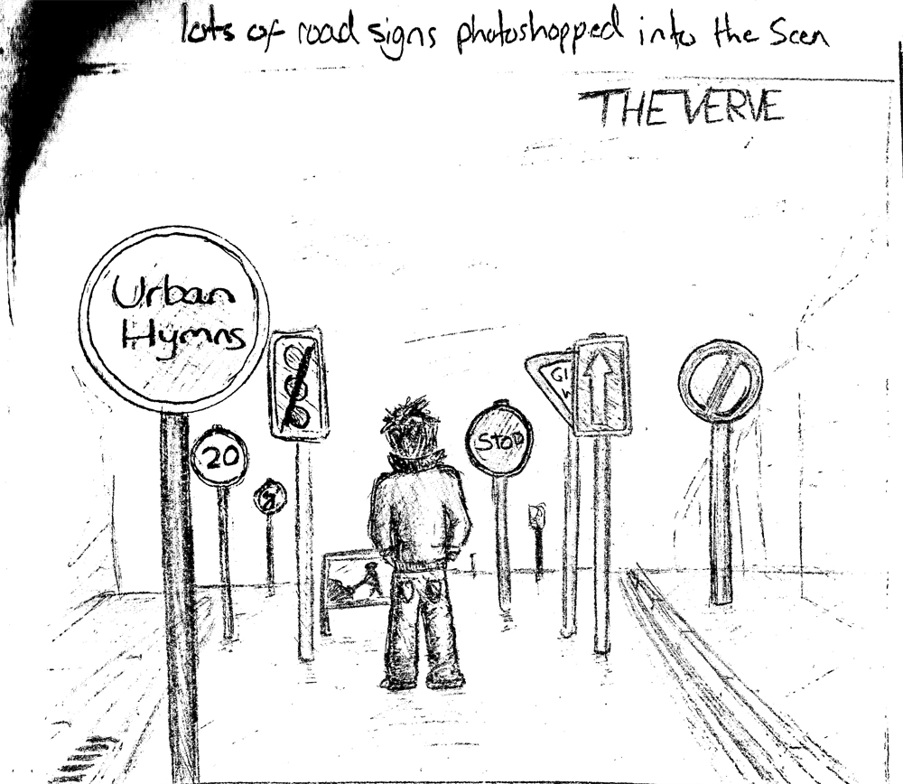
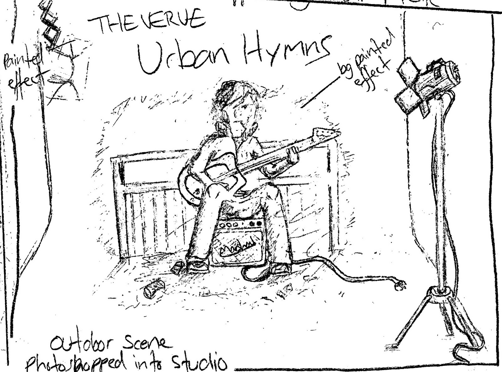
Here are some of my initial sketches and ideas for my album covers.
My first idea is my favourite and i think the most effective. It's composed of a photograph of a man standing in the street, with road signs (mainly restrictive ones) photoshopped into the scene to represent the chaos and frustration of modern/urban life.
My next idea is pretty basic and the first thing i thought of when choosing the album. Simply a close up of the next of a guitar with a pick wedged into the strings having the title of the album photoshopped onto it. It doesn't have much meaning or narrative and is the simplist idea.

My next idea is quite literal of the album title and not one of my favourites. The photo would be of a person playing guitar to the scene of a city below, with photoshopped elements to create a more grungy urban feel.

My final idea is probably the hardest. Basically i will shoot a photo of a person sitting in the street with his guitar and amp, possibly busking, and using another shot of a studio scene make it look as if the original shot was set up in the studio. The idea behind this being that part of the struggle of modern life is not knowing what is real and what is fake (or what is true and what is not)
I generated these ideas while listening to the album and these are the themes and feelings i picked up upon. The next step will be to refine the ideas and do some test shoots and see what kind of results i can get in photoshop.
Saturday, 13 November 2010
album research
I have chosen to make my own cover of The Verves' third album; Urban Hymns. Before i start coming up with any ideas i have looked at The Verves' previous albums to get an idea of their cover style, fonts and see if there is any reccuring themes or designs.
Their first album A Storm In Heaven notably didn't have the album name on the cover and had a very muted colour palette or blue tint. None of the band members are shown, although the indistinct figure in the cave entrance could be one of them. This cover to me comes across as having a meaning or narrative.

The next album cover is A Northern Soul. This cover has the album title and bands' name as a font rather than part of the artwork like on the previous album and all four members of the band are the main subject of the cover. A very different style compared to the previous album, with a more moody and representative look.

The Verve's next album was Urban Hymns. The text on the cover is pretty much the same as the last album with small differences in the font. Again the band members feature on the front of the album, although less manipulated or 'photoshopped' than before. As far as the photo goes it is rather standard with very little visual communication other than 'this is us' which i guess is what they were after.

Their most recent and final album is Forth. Completely different from their previous album covers Forth includes the same text from Urban Hymns but centered, the photo not featuring any band members and having a more arty/painterly quality to it.

After looking at all their album covers i can see that they have very little in common with each other, this may reflect the bands frequent break ups and reformations and different musical directions over the years. I would like to keep the text from Urban Hymns as it seems to be the only thing that is kept the same on more than one cover, and i plan on having at least one person feature in my cover seeing as Urban Hymns and A Northern Soul feature band members. I will now sketch some ideas for my own version of Urban Hymns... while listening to the album as loud as my speakers go.
Their first album A Storm In Heaven notably didn't have the album name on the cover and had a very muted colour palette or blue tint. None of the band members are shown, although the indistinct figure in the cave entrance could be one of them. This cover to me comes across as having a meaning or narrative.
The next album cover is A Northern Soul. This cover has the album title and bands' name as a font rather than part of the artwork like on the previous album and all four members of the band are the main subject of the cover. A very different style compared to the previous album, with a more moody and representative look.

The Verve's next album was Urban Hymns. The text on the cover is pretty much the same as the last album with small differences in the font. Again the band members feature on the front of the album, although less manipulated or 'photoshopped' than before. As far as the photo goes it is rather standard with very little visual communication other than 'this is us' which i guess is what they were after.

Their most recent and final album is Forth. Completely different from their previous album covers Forth includes the same text from Urban Hymns but centered, the photo not featuring any band members and having a more arty/painterly quality to it.

After looking at all their album covers i can see that they have very little in common with each other, this may reflect the bands frequent break ups and reformations and different musical directions over the years. I would like to keep the text from Urban Hymns as it seems to be the only thing that is kept the same on more than one cover, and i plan on having at least one person feature in my cover seeing as Urban Hymns and A Northern Soul feature band members. I will now sketch some ideas for my own version of Urban Hymns... while listening to the album as loud as my speakers go.
Subscribe to:
Comments (Atom)