Thursday 5 May 2011

final cover: front and back

Right! finally getting my final front cover on here. It took about an hour's shooting time and about four to five hours of photoshop work over several days to complete, but i am happy with the result.

Front Cover:

My idea was based on the theme of internal conflict, the battles fought inside a persons mind. This is based on an earlier sketch i did and i am glad i followed it through, despite the effort. I will post the cover first then how i did it...

Here it is. It may be a little dark on macs, if so i will edit it and re-upload at a later date. It was made by doing a series of self portraits while having the camera on a tripod so the environment and camera angle and zoom was the same for every shot. The exposure also had to be the same so it was shot on manual mode. i used markers on the floor to plot out where each person would stand, mainly to compose the shot but also to allow the observing people to look as if they are watching the fight. Once i had all the photos (several public clothes changing sessions later) i brought the base photo into photoshop...

This is the base photo, the photo all the other elements will be added to. I used this as the base because it was the photo with the person standing the furthest back in the shot. All the added peices will be in front of this person.

Once all the layers where in i began merging them by using the eraser and lasso tool, along with me graphics tablet to cut around most parts of the people and delete the rest of the layer. This took A LONG time and i lost my temper on many occasions, but i got it done in the end. I could have probably used some auto selection magic wand tools but in my opinion they leave a sloppy result which always has to be tidied up anyway, might as well get it done right the first time.


Now for some blood. As in my other posts my handy collection of paint splats is used again, this time i made them a blood red colour.


I set them to 'overlay' layer mode and transformed them into position. The blood coming off the face is a little hard to see but any lighter and it looked too fake. I guess subtle is the key word here.


Now the album text! this was quick and easy, i basically rasterized some text and erased bits to make it look faded and worn.

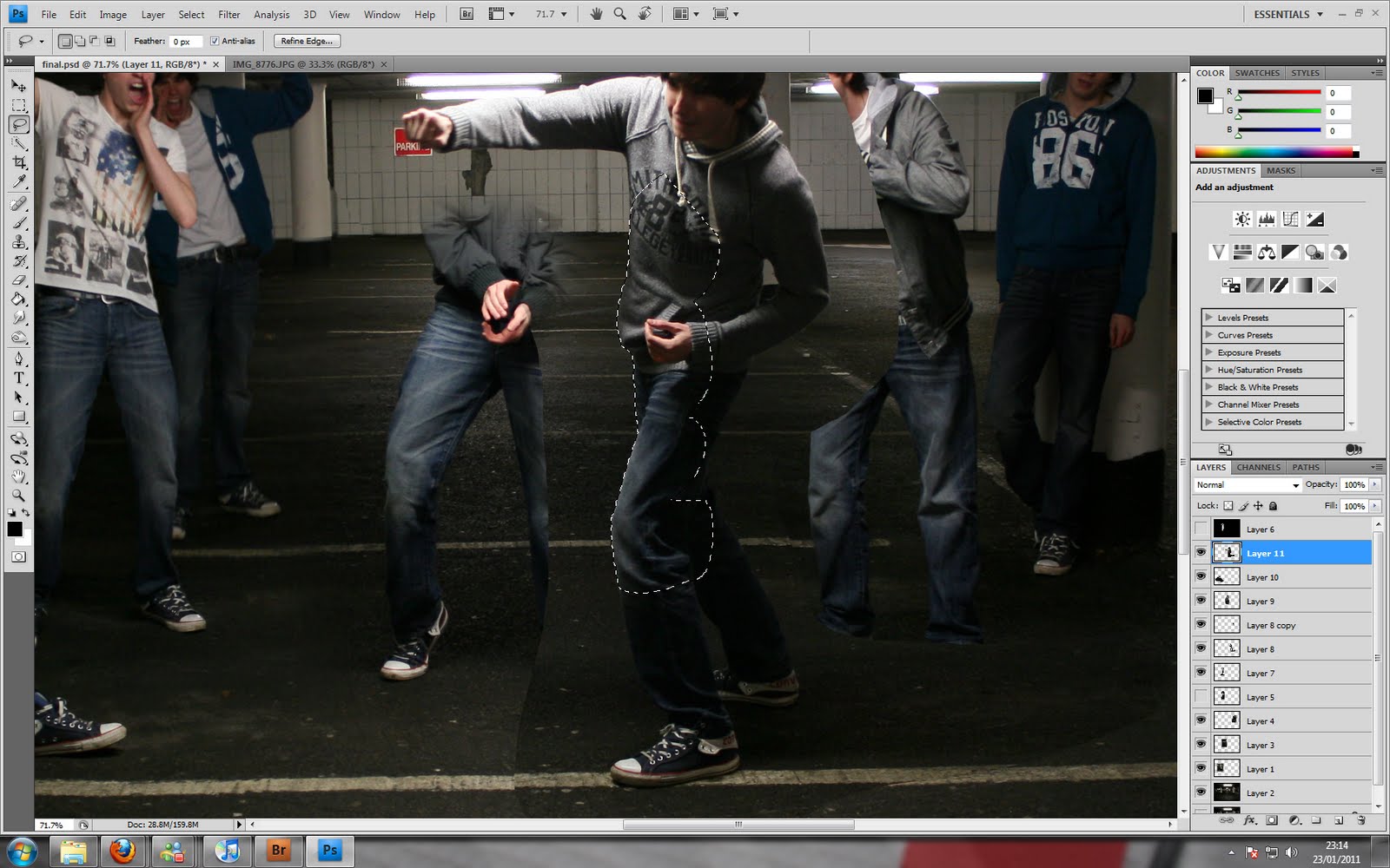
I then flattened the final image and duplicated it. To this duplicate i added an Angled Strokes effect, reduced the opacity and tinted it blue with the hue/sat window. This gave the final cover a bit of mood and atmosphere.

Back Cover:

The back cover is very simple, I based it on my original sketch i did at the start of the assignment. I took a shot of the tarmac in the carpark and played with the contrast a bit to match it to the front cover. I added the tracklist from the real album and used the same method on the text as the front cover to make it look gritty and worn. I took the barcode from a back cover image online and pasted it in. Done!


I learnt a lot from this assignment and improved my photoshop skills considerably. I used many different layer modes and effects and tools to create the final images and i know i will find them invaluble in the future.


playing in photoshop... again

Here is a breakdown of my latest photoshop session: creating an advert from scratch.

To start with i needed a product, which would be my Skullcandy headphones. I wanted to keep it simple looking so i shot them on my desk with a lamp to one side creating interesting shadows, and the main light in the room on so they weren't too harsh.

I added a little vignetting in photoshop by cutting a circle out of a black filled square and then Gaussian blurred the rest, leaving just the soft outer edges. So far so good.


To make the headphones my own design i had to do some heavy photoshopping. I started with the colour. Rather than modify the whole lot i chose certain parts of the headphones to change colour, easing my workload. I started by using the quick select and circle select/deselect tools to perfect my selection (with the aid of my graphics tablet). I selected all the bits that i wanted to change using this method, which took about 20 minutes.


To change the colour (i wanted a nice vibrant orange) i opened the hue/sat window, set it to colourise (or colorize as the americans over at Adobe would have me spell it) and found the colour i was after. Straight away it looked pretty awesome.


Colour adjustments complete


 Next came the logo. Now i had decided to rebrand the headphones to my own fictional company 'Waveform' so the logo naturally had to be a wave. I found a similar logo through google images and just filled in the bits i did/didn't want with white/black to get my own logo the easy way.


Then it was just a matter of filling the white with orange, adding grain to match the headphone material (filters>noise>add noise) and rotating it into place. To blend it in i cut all the black out and clone stamped in the gray plastic from the headphones. Sorted.


Now my idea was to have the company customise the headphones in any colour combination desired, so a decided to theme the image that way by adding paint splats over it, as if they'd just been sprayed. I have a selection of stock images i bought a while back, which included black and white photos of paint splats and drips (pre-keyed). So it was easy to simply change the colour with hue/sat and set the layer mode to 'multiply' and presto, the paint splats look real. Some erasing was required where the layer mode looked wierd on the headphones, which ruined the effect of the paint being underneath them.


Paint splat set to 'multiply'. Finding the right layer mode was a matter of trial and error.


All the paint splats complete using the same method as before (although some required different layer modes). The final image is pretty much done now, i just wanted to add some text and a company logo to actually give it the promotional advert effect.


To save me posting another 12 or so images i am going to talk through this step in one post. Firstly the main orange splat was made using default photoshop brushes at different opacities. The text was cut out by first creating the text, rasterizing it so it could be edited and then selecting it, going to the splat later and deleting the selection from it. A simple idea but i reckon it looks pretty good. The logo i made/stole/edited for the headphones was used to cut out the shape from another splodge of paint. I finish it all off by using brush and erase tools with various brushes to add painterly details around the edges. This took forever and i hope i never have to do it again. That's it pretty much done now, but i wanted to emphasise the colour customisation options...


So by using the hue/sat tool to modify the reds in the image (once it was flattened) it was easy to get as many colours as i wanted! which is lots...


equipment list

Here's a quick list of what i took with me to do my final shoot:

Canon EOS400D
Canon 18-55mm lens
Tripod
Lens cloth

Various clothes
Guitar
50p coins (to use as markers for standing positions, photoshopped out later)

bang

cool album covers

I looked up some album covers i liked (and some of my personal faves) as research for creating my final cover. I wrote a little about each one and why i like it to try and identify what makes them appeal to me.

This is one of my favourite albums of all time, Sunshine Underground's second album, Nobody's Coming to Save You. I like the design a lot, it seems industrially themed and has an almost communist Russia propaganda feel, or maybe art deco influences. Either way i think it's a really cool design and the colour pallette works really well.

I found this on a website of greatest album covers and it really caught my eye. Such a simple shot/idea yet very iconic. And i think that's why i like it, simple yet effective. I can imagine the shoot that produced this artwork was probably wrapped up in well under an hour.

Another cover that caught my eye is Starting Line's Direction. Again a very simple idea but it works really well and is immediately recognisable. I like the way the ground frames the edge of the album and how if i look at it full screen i find i unconsciously tilt my head to the side to try and see it the right way up. The blue and yellow work really well too, this is a great cover.

Another one of my favourite albums, and my favourite album cover ever. It's very arty and meaningful, the title and haunting image work together really well. The man with the gas mask (which implies to me that the world has been the subject of some kind of devastation like nuclear war) looks up in desperation at the figures flying above. Whether they be the cause of the destruction or the saviours of mankind leaving the fallen behind i haven't decided, all i do know is it is very thought provoking.

 This had to be on my list of favourite album covers. It's a great album and such an iconic cover and yet the photo itself was taken very quickly and not even focused properly. Maybe that's why it appeals so much as it adds to the gritty, punky feel of the album.

Another one of my own albums that i pretty much bought just because it looked good. The image is made up of many photographs of the same type of object (gas storage thing) layered over one another. The effect is really cool and i am going to try it myself once i have decided what kind of structure to use. The colour scheme really finishes it off with a sickly, toxic yellow smog colour which compliments the gas storage thing.

Finally i chose the White Stripe's Elephant album cover. I love it because it's a simple studio shot but really well thought out. I am seeing a theme here with my favourite covers and that is simplicity (apart from one or two). I think it stands out mainly because of all the red but also because there's little details that keep you looking at it while you figure it out.

Saturday 23 April 2011

playing in photoshop

As i am a big fan of the Aliens films i thought I'd do a little experiment in photoshop involving the alien design that stars in them. First i went through my collection and found a suitable photo to use as the scene; in the end i used one of my own that i shot during the snowfall last year:


My plan was to integrate one of the Aliens into this photo as best i could, as if i shot the photo with it there. So first i had to find a good image of an Alien to begin working on. After searching on google i quickly found the perfect photo which was used as promotional material for the movies:


To begin i opened both images in photoshop and put them on seperate layers, flipped the Alien horizontally, converted the layer to black and white to match the show photo and after positioning the image where i wanted up on the car, began to cut around it using the lasso tool and erasers with my graphics tablet. This would have been quite hard with a mouse but using a graphics tablet meant i could get a clean selection quickly and easily. The alien sat in the scene quite well but to sell it i began to add subtle elements that really help to sell it. Firstly was the reflection in the car window and condensation from it's breath. The reflection was made by cutting a section of it's mouth off, copying it to a new layer and adjusting/blending it until it looked right. The condensation is just a smoke brush with gaussian blur:

Shadows seem to be the best way to trick the eye with photoshop art so i used a selection which was copied onto a new layer, made black by using hue/sat > lightness and gaussian blurred. Then it was just a matter of using the transform tools to get the angle right so it looked as if the shadow was cast from the nearest street lamp:

Finally i used the trademark acid saliva dripping onto the floor to finish it all off. I did this mainly because I'd never created an effect like this before so it was a good learning experience and looks really cool. I did this by clone stamping the tarmac under the car onto the snow, creating small melted areas, then i used photos of cigarette smoke against a black piece of card to create the smouldering road surface. The smoke was set to screen mode so the black background vanished leaving just the white smoke visible:


To polish it all off i used the hue/sat tool set to colourise to give the whole image a slight blue tint, which is an effect seen in the first two alien films especially in scenes involving the Aliens. This was a big learning experience for me and took about a few nights to get done but it was really worth it. The final result...

'Dead of Night' - Jamie Osborne (click for full size)


Monday 7 February 2011

Triptych creation!

As part of our photoshop lessons we learnt how to make Triptychs... a series of photos in the same image that relate to each other, telling a story and complimenting each other... or something. Basically I took 3 photos that i thought sat well together and had something in common (sea front, sunset etc) and opened them in photoshop. Then i made sure they are all the same size using the crop and 'Front Image' button and added them all to the same image session. After composing them with the spacing how i wanted i added a white background and border then saved it out as a jpeg to stick on here; tada

'The Thames Triptych' - By Jamie Osborne

Monday 31 January 2011

album cover insert/leaflet

This is my final design sketch for the insert of my album, as mentioned before it will include lyrics, band info and quotes relevant to the album. It will be made using a photo of the guitar featured on the front cover shot against the surface of the car park. I may slightly blur the photo and have it out of focus so the text on top is easier to read...


The front and back of the leaflet will be the front and back cover of the album, the back cover will not however have the track list on it.

files types

As part of this project i am going to look into the various file types for digital images and their advantages and disadvantages.


JPEG: Possibly the most common file type, JPEG files are small, good quality and compatible with pretty much every peice of hardware and software in the world. JPEG files are compressed to make them smaller and easily stored or transferred, however this compression causes some loss of quality depending on the level of compression.


Advantages -

  • small files size
  • good compression/loss ratio
  • most popular for displaying/sharing online
  • universal compatibility


Disadvantages -

  • compression can lower quality
  • does not preserve layers
  • limited to maximum bit depth of 8-bits per channel


TIFF: TIFF files are larger than JPEGs but as a result they are higher quality and feature lossless compression, which means they can be reserved as many times as required and not suffer quality degradation. TIFF files can also be saved with layers created in photoshop preserved, so when re-opened all the layers are still separate and editable.

Advantages -

  • high quality
  • lossless compression (smaller than original file, yet not as small as a jpeg)
  • preserves layer information


Disadvantages -

  • larger file size
  • not supported by all software/hardware
  • any bitdepth supported (restricted by software/application)


BMP: BMP or Bitmap files are generally uncompressed and retain all the image information of the original. However it cannot preserve layers, is not universally compatible (it was created by Microsoft) and is generally obsolete due to the TIFF file format having all of BMP's pro's plus more, and less of the cons.

Advantages -

  • preserves all the file data (unless software compression is used)
  • compatible with all Microsoft-friendly software


Disadvantages -

  • limited bit depth
  • larger file sizes than jpg
  • does not preserve layers


PNG: PNG files were created for internet display and transfer and are capable of storing alpha channels and therefore the transparency contained in an image ( 8 bits as opposed to GIF's single bit of transparency). Like TIFF they feature lossless compression and so have larger file sizes than jpegs, and like GIF files (which PNG was created to replace) can store animation information.

Advantages -

  • can store 8 bit alpha channels
  • saves animation data
  • compatible with most web browsers
  • lossless compression


Disadvantages -

  • larger file size than jpeg
  • does not preserve layers


RAW: RAW files are saved when taking the actual photograph, and as the name suggests it saves the raw image you have just shot so during editing blown out highlights or too dark areas can be recovered as the data in those areas have been saved even though they are not visible at first. RAW files are much larger than jpeg, i have had them as large as 20mb (whereas the largest jpeg i can remember having is about 3mb). Special software is required for opening and editing RAW files, such as photoshop or Capture One.

Advantages -

  • captures all the data in the scene, whether exposed correctly or not
  • large overhead for editing (can change the white balance etc AFTER shooting)
  • maximum quality/size


Disadvantages -

  • maximum file size (very large compared to jpeg)
  • can only be opened in special software
  • comes in many different formats (1 or more file extension for each manufacturer)
  • cannot be uploaded or displayed online without conversion to other format
For most of my work and for this project i will be shooting in RAW, saving as TIFF or photoshops native format PSD for the duration of the editing then either saving as a TIFF or JPEG for final presentation depending on what is being done with the image (internet? printing? monitor?).

location scouting

After exploring the various car parks in basildon and essex i believe i have found the best location for my shoot... behold the Asda car park in Basildon:


If possible i'd like to feature a painted arrow in my cover as it's known to be a strong visual symbol, but that is dependent on being able to shoot in the middle of the road. I will try and ask for permission but regardless on whether i get it or not, this shall be the location of my final shoot.

some more sketches and ideas

Here's a few more sketches for my album cover project. This first upload is my final idea for my back cover; keeping to the urban theme of the original album and my front cover i wanted it to be more simple in contrast to the front cover which is heavily photoshopped and has a lot going on. It's basically a photograph of a painted line on a road surface which will probably be shot in the same car park as my front cover...


This next sketch is of the insert/leaflet that will feature notes on the band, selected lyrics and quotes. It will be an accordion-style fold out piece of card. For the design printed in the background i am going to go for either a top down view of a double yellow line in the road, various restrictive road signs or a top down view of my guitar placed on a road/tarmac surface. Again these are all urban themed and i will use post processing in photoshop to give them all a contrasty, edgy look similar to that in the screenshots from the Bittersweet Symphony video i posted earlier on my blog.

Wednesday 26 January 2011

ideas no. 2

After sketching some more ideas while listening to the album i have come up with a refined idea for the main cover! here it is!


As it's pretty rough i will describe it. The scene is a carpark, probably a multi-story somewhere in Basildon.  I will set up a tripod and take photos of me in different positions and outfits and pose as if i am interacting with each copy of myself. The two in the center will be fighting each other while the rest watch, either cheering it on, ignoring or trying to break it up. This basically will describe the internal conflicts of modern life, a common theme of the album.

Now to figure out how to do it...

Saturday 22 January 2011

more lyrics

 The Drugs Don't Work lyrics

All this talk of getting old
It's getting me down my love
Like a cat in a bag, waiting to drown
This time I'm comin' down

And I hope you're thinking of me
As you lay down on your side
Now the drugs don't work
They just make you worse
But I know I'll see your face again


Now the drugs don't work
They just make you worse
But I know I'll see your face again


But I know I'm on a losing streak
'Cause I passed down my old street
And if you wanna show, then just let me know
And I'll sing in your ear again


Now the drugs don't work
They just make you worse
But I know I'll see your face again


'Cause baby, ooh, if heaven calls, I'm coming, too
Just like you said, you leave my life, I'm better off dead


All this talk of getting old
It's getting me down my love
Like a cat in a bag, waiting to drown
This time I'm comin' down


Now the drugs don't work
They just make you worse
But I know I'll see your face again


'Cause baby, ooh, if heaven calls, I'm coming, too
Just like you said, you leave my life, I'm better off dead


But if you wanna show, just let me know
And I'll sing in your ear again


Now the drugs don't work
They just make you worse
But I know I'll see your face again


Yeah, I know I'll see your face again


I'm never going down, I'm never coming down
No more, no more, no more, no more, no more
I'm never coming down, I'm never going down
No more, no more, no more, no more, no more

Another top song off the album, The Drugs Don't Work has helped me further the design for my album cover. The solemn lyrics and drug references further my desire to create a grungy, gritty theme to the cover and all it's parts.

Sunday 9 January 2011

creating custom text effects

i wanted to learn how to create a grungy urban style text for my album covers so i decided to give it a go using the eraser and some images of splatted paint. I started off by creating a new canvas and giving it a background colour (orange), then created the text i was going to edit. Before i could go any further the text needed to be rastarised so it could be manipulated, once that was done i selected the eraser tool, picked a brush to use and set about cutting into the text to created the grungy effect.


 After i spent absolutely ages doing this to all the letters i used the rotate tool to make it look more dynamic and added paint splatters which i found on the internet. These splatters were pure black and white to make it easier to blend into any scene. I simply added the photos, scaled and rotated them and set the transfer mode to screen.


^ Before setting transfer mode

^ After setting transfer mode!

Done! I am planning on creating something similar to this for use on my final covers

cutting out things in photoshop

to practice some photoshop before i begin work on my album cover i created a test image to experiment with techniques i will use to create my final work. I started off by opening one of my photos in photoshop!


I then found something to add to the image to practice extracting elements and blending them into other images. I found this nissan micra to stick in the mud, which will give the result some meaning by portraying my hate for these cars.


The first step was to extract the car from the image... i did this by making use of the lasso selection tool and the eraser and then used the levels editor to match the contrast. When deleting with the lasso selectrion tool i feathered the edges slightly to make sure it didn't leave any jagged edges. I also used the transform tools to scale and deform the car to get the perspective looking right, although the perspective could only modified to a certain limit so i placed the car carefully in the scene.


I then added shadows and reflections to blend the car into the scene better. To create the shadows i made a shape with the lasso selection tool then used the blur filter and eraser to make the shadow similar to the other ones in the scene. I made the reflection in the water by cutting and pasting a section of the car and using the transform tools to put it in the right place and lowered the opacity.


Then in a similar manner i added jesus.